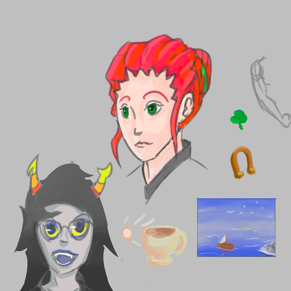
• Last Seen: 9 yrs ago
  • Joined: 10 yrs ago
  • Posts: 438 (0.12 / day)
  • VMs: 0
  • Username history
    1. monstahunta 10 yrs ago

Status

User has no status, yet

Bio

User has no bio, yet

Most Recent Posts


I also did some arm studies, but I really need to work on drawing arms.


I finally figured out what I'm going to do for this.

Plans A, B, and C didn't go so well. >_>'

Here's hoping that my execution of the piece is as good as the concept sounds in my head.
Robeatics said
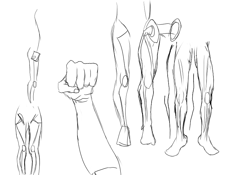
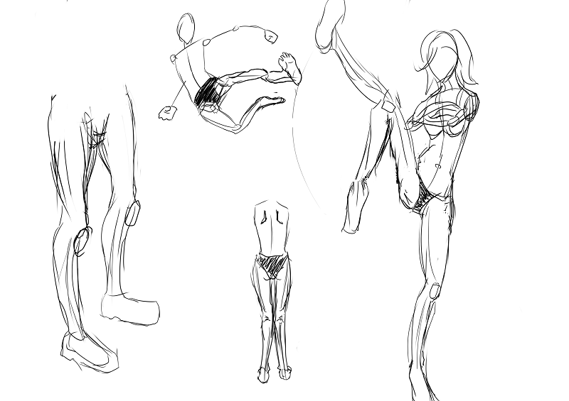
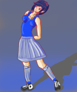
I would love to join this, I feel like it'd be good motivation for me to improve myself. C: Here's a few older pictures from around the beginning of the summer, I've improved mildly in anatomy and posing but I still have a while to go. I'll try to get up fresher drawings once I can get a hold of them! (Forgive the crappy, enormous phone pictures. :,0 )


Sketch 1: I'm not sure if it's just my internet, (which is terrible), or not, but I can't see this one.

Sketch 2: Anatomy-wise, it looks really good to me. I would suggest shading in the cast shadow from the nose to help add a little more depth. Good job, though.

Sketch 5: I love the detail on the arms, but I would suggest thinking about how a silhouette of the figure would look, and if the silhouette would clearly convey what you're trying to present to the viewer.

Sketch 6: Needs some clothing folds. Even if you think an article of clothing wouldn't be affected by the underneath figure so much, it would still bunch up on itself.
EDIT: So I've been practicing my anatomy.

(It's not especially detailed nudity, as just the shape of the breasts are drawn, but this image is of a female character not wearing any clothes. Yet.)


I have a feeling something is off in her shoulders, and I couldn't really figure out how to place her left hand to look right.

Also since I was inspired to draw a picture of someone having some hot chocolate, I did this really rough drawing to practice my perspective.

Roran Hawkins said
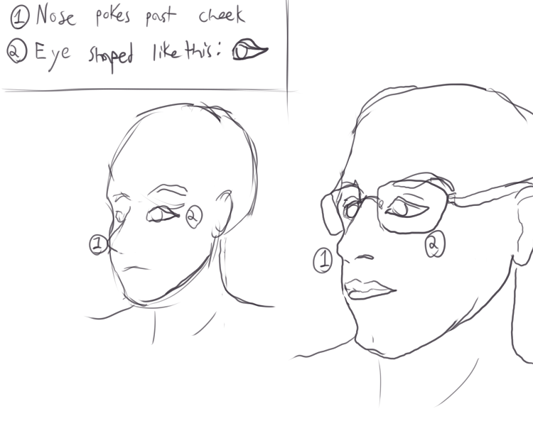
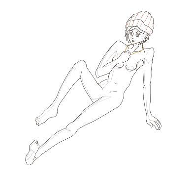
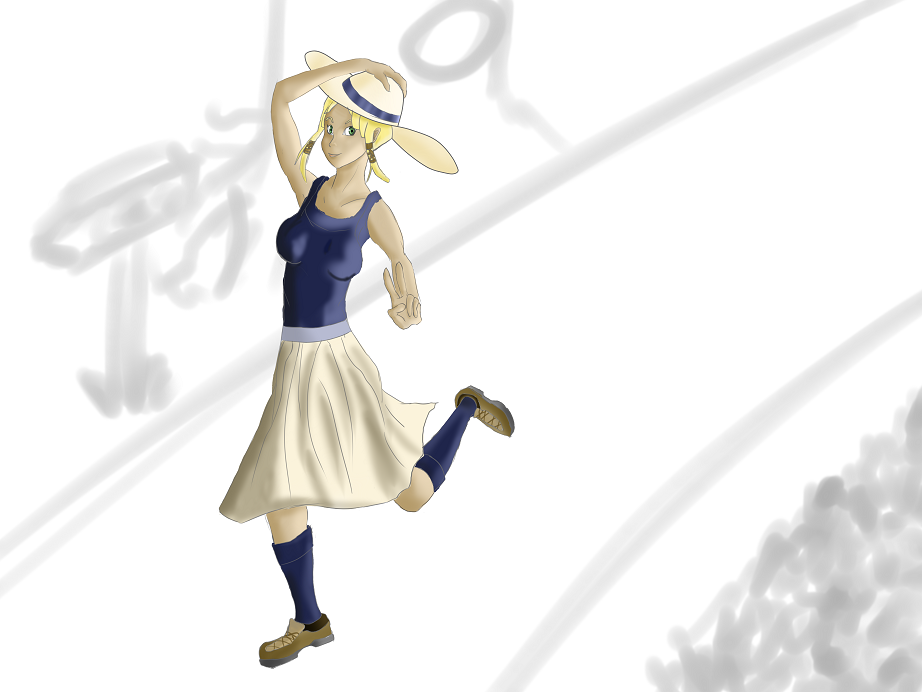
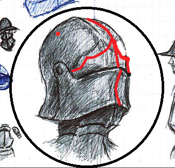
I've done a draw-over on your last drawing to show my points. Beware, it was done with an online painting tool and a computer mouse.Your pose is a bit awkward due to the weird angle of her left arm and hand (a fault Sherlock pointed me at in my last drawing). When trying to draw someone in a certain pose, always try to find references for it or getting someone (even yourself- to quickly pose for you. You easily have acces to someone doing said pose naturally, and basing yourself off of that adds a genuine feeling to it. Furthermore I would recommend delving further into the topic of anatomy. As you can see I left my sketches of the drawover (in red) still there so you have an idea of how I specifically use shortcuts to learn anatomy. Anatomy is the one thing that makes or breaks most if not every drawing of an organism that's intended to be at least semi-realistical, and still the bane of even artits like Sherlock. The only cure is lots of practice and references. A short summary of faults I immediately noticed: Her breasts were too low and had a really sphere-like shape, as if someone cut a ball in half and taped them to her ribcage. While in a front on drawing of a relaxed pose this is not too noticable, once movement is involved the breasts move along. (the same with breasts of men. I just watched myself in the mirror today, it's almost spooky how they can move if you pay attention to it.) Secondly, her arms, legs and middle were all too long. I can give you the advice when drawing without clear or with little references to use parts of the body you already drew to measure the parts you still have to draw. A good measuring unit for example is the head. Handy links: ° http://farm2.static.flickr.com/1021/836560773_9dc73c2e2f.jpg° http://illustrationage.files.wordpress.com/2013/04/andrew-loomis-figure-drawing-for-all-its-worth.pdf


Thanks for the tips, and especially the draw-over. =]

I'll make sure to try to learn the, "heads as units of measurement", thing again. I could never seem to get that right when I try to use it in my drawings, but it's been a few months, so hopefully It will click better as I'm practicing.

As far as using a reference, I recently bought an armature to use for posing, but I haven't got the hang of using it yet. =T

Roran Hawkins said
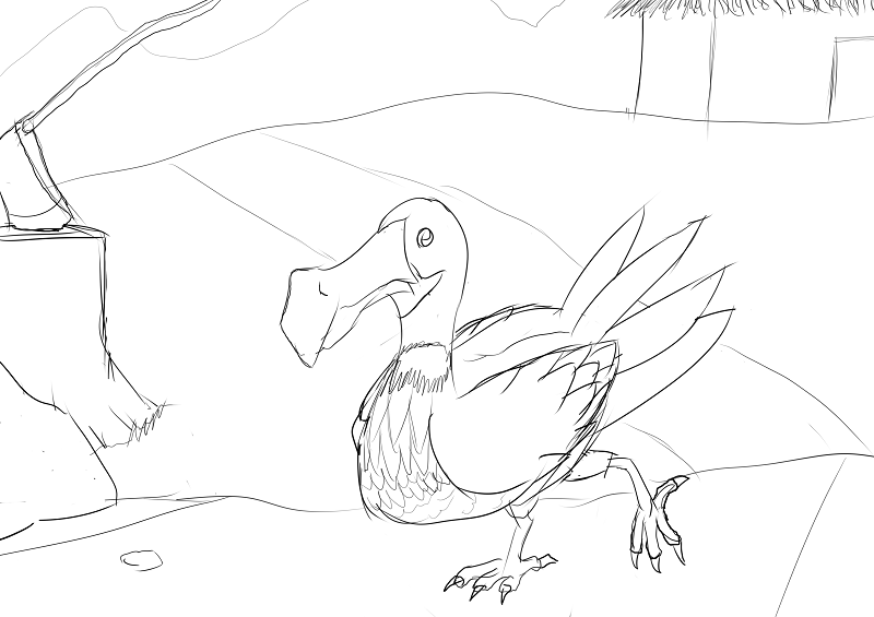
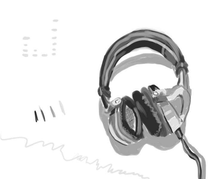
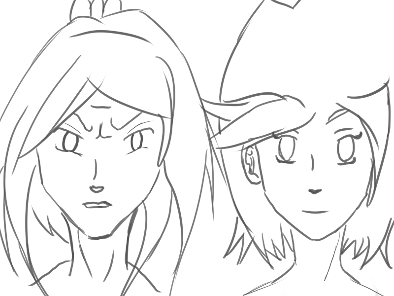
Also, one of my own:


These look great.

My favorites are the first guy, in the second row, (with the hook for a hand), and the image of just the man's head in his armor.

From the looks of it though, it seems that you overcompensated for how offset the center line would be between the lower portion of the helm, and the top portion.


I did the outline in red for this one, and it ended up ruining anything I wanted to do with her eyes. =\


These two are sisters that I came up with for a comic that I'm planning on doing once I improve my abilities enough. They're sisters that have very similar personalities, but very different ideologies. I really like drawing the younger sister, as I'm sure you could tell.


I'm conflicted about this one. I really don't know how to feel about it. I felt very accomplished when it was finished though, as it's probably the best I've ever done for painting skin.

I think most of the problem is I just used a very soft brush to paint everything, and the obvious lack of background.
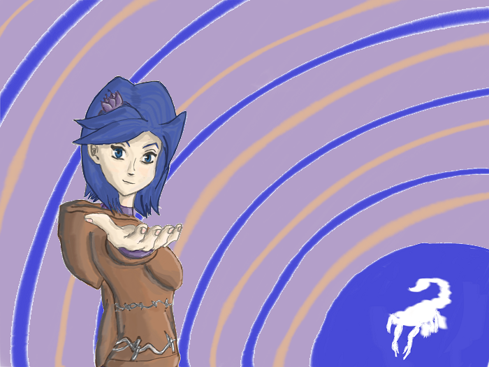
Sherlock Holmes said -snip-


Here's the picture I was using as a reference as I was doing the painting.


I tried to do more of a close up view than that of the picture, so I estimated a lot in terms of the size, and placement of the different structures of the flower.

The stem was complete guessing, and is definitely the worst looking part of the painting IMO. Though after finishing the painting, I also noticed that I used too much blue for the actual, "mirror", part of the flower. So now that's sort of making me cringe when I look at the painting as well. =T

As for Andrew Loomis, I have a small collection of his books on my external hard drive, but wasn't sure where to start. I guess I'll go through, "Figure Drawing For All It's Worth", and post my progress. =]

Thanks for the tip on not painting on a white canvas as well. I've been wondering how to make my art seem less washed out.
Hello, and welcome to the guild!

There are many fun avenues for releasing your creative writing impulses here, and there's also an art section in The Gallery subforum.

Hope your stay at The Guild is a fun one! =]
--Accidental Double Post--


Added more values, and I really like the feel they gave the picture. I also fixed the eye, but somehow lost the expression I was going for.

Corel Painter X3 was being temperamental, so I lost some of the more refined lines from the original.
© 2007-2024
BBCode Cheatsheet