--Accidental Double Post--
monstahunta
Member
Seen
11 yrs ago
Looking back, I really hate the one I did called random. haha.
I think the biggest problem is the girls face isn't really interacting with the background, like at all.
I think the biggest problem is the girls face isn't really interacting with the background, like at all.
OP
stark snarky genius
Member
Seen
5 yrs ago
@monstahunta: Did you use reference for the painting of the flower (?) or did you use reference. It looks interesting, but I'd be curious to know more about it before offering my two cents.
I think the best advice I can give you right now is to read through this book and do some of the exercises in it. Andrew Loomis will help you to get your anatomy/proportions correct. He's an excellent resource while you're trying to improve -- don't be afraid to tap into him! Anatomy is a difficult and frustrating subject to study, even for professionals. (Most will refer to anatomy books and/or shoot reference pictures to help them get it right when working on a piece. There's no shame in getting a bit of help, especially while learning!)
When painting, never paint on a white background (applies in both traditional or digital mediums) -- the reason for this is that it'll mess up your value scale (darks/lights) because you're constantly comparing everything to the brightest value there is. This will make work look washed out and, if working in colors, it'll make things look very dull/lackluster. Always tone your canvas. Pick a medium tone (it can be any color you want because you're just going to paint over it all anyway) and fill the entire canvas. Once that's done, then start your painting. It'll improve your contrasts/values and color work tenfold.
@Roran: Don't paint with white! (See above comments.)
Get reference for that armor and do a study. Try to see how the light works on the surface of the metal and understand why. Which direction is the light coming from? Which highlights are reflected light from the environment the armor is in? How do the shadows work and what colors are they? Metal can be tricky to render and definitely requires doing actual studies to get it right.
The Shinobi pieces aren't bad. Nice foreshortening for the pose. You seem to have a tendency to make your heads a bit on the too small side for your figures. I'd recommend checking out the Loomis book I linked monstahunta to above -- it should help you straighten the issue out.
I particularly like the profiles on the 'Lords of War' pieces. Good proportions and nice expressions. (Each face definitely has a bit of personality to it.) Profiles can be hard to do sometimes, so kudos on those!
@Brand: Since you have a bit more experience, I'd recommend doing some studies from George Bridgman. It looks like you're guessing a lot on the actual underlaying structure of your faces/anatomy and I think you'd really benefit from doing some dedicated construction studies. Bridgman is great when you already have a bit of knowledge under your belt -- his constructive methods are top notch. (And his line work is really excellent, too. One of my favorites.)
The 'random' piece has a nice color scheme, but you're right about the head not interacting too much with the environment. It almost reminds me of an attempt at 'shape sifting', which is a style of art that Android Jones came up with. His work is really interesting to look at (another one of my favorites) -- every piece is built from using miscellaneous shapes to paint with, repurposing them into other items as he goes. It's really cool to watch him work.
Some
videos
of him working
on a piece that's kind of similar to the to the idea of the two pieces you did.
Android does a lot of live shows now where he'll go to a club, then a DJ will play their set, and he paints live on a huge screen while people dance/party around them. If you look him up on youtube you can find a lot of his performance art and it's cool to watch him work and see what the music is inspiring him to create at the same time.
Keep up the good work, guys!
(Sorry again for the delay! My new floor literally just got finished being installed about twenty minutes ago. It's been a bit crazy around here. lol)
Android Jones is also one of my favorite artists. My avatar is one of his pieces. The biggest problem I have with his videos, even the ones he lables "tutorials" is they are sped up far too much to follow along or study.
Can you also be more specific as to which parts of the face it looks like I'm guessing on?
Can you also be more specific as to which parts of the face it looks like I'm guessing on?
monstahunta
Member
Seen
11 yrs ago
Sherlock Holmes said -snip-
Here's the picture I was using as a reference as I was doing the painting.

I tried to do more of a close up view than that of the picture, so I estimated a lot in terms of the size, and placement of the different structures of the flower.
The stem was complete guessing, and is definitely the worst looking part of the painting IMO. Though after finishing the painting, I also noticed that I used too much blue for the actual, "mirror", part of the flower. So now that's sort of making me cringe when I look at the painting as well. =T
As for Andrew Loomis, I have a small collection of his books on my external hard drive, but wasn't sure where to start. I guess I'll go through, "Figure Drawing For All It's Worth", and post my progress. =]
Thanks for the tip on not painting on a white canvas as well. I've been wondering how to make my art seem less washed out.
OP
stark snarky genius
Member
Seen
5 yrs ago
Brand said
Android Jones is also one of my favorite artists. My avatar is one of his pieces.
Ha! So it is. I rarely pay attention to people's sets, so I never looked properly at yours to notice that it was actually one of his pieces. (Though, I do recognize it now.)
Brand said The biggest problem I have with his videos, even the ones he lables "tutorials" is they are sped up far too much to follow along or study.
I have several of his videos and they're interesting to watch. (They're really what turned me on to using Corel Painter, rather than Photoshop.) I have no trouble following along to them -- even though they're sped up, you can still get the gist of what he's doing. (With videos like that it's more about watching their technique and their general process. It's really rare you'll find a 'tutorial' video done in real time so that you can follow along with them. I have yet to really come across any like that in my own research at least.) I mostly enjoy just listening to him talk about what he's doing and about the choices he's making. Though, since I don't really tend to emulate his style, I suppose a more generic overview of his work suits my purposes fine, rather than doing any in-depth studies based off it.
Brand said Can you also be more specific as to which parts of the face it looks like I'm guessing on?
I mostly notice issues in the top half of the heads. Your placement of cheekbones (zygomatic arch area) up through the forehead/temples. Your cheekbones always vary slightly in each face (so they're uneven) or they'll be placed too high. (Where the bone structure would be virtually impossible in a real face.) If you do some studies of skulls from various angles it should straighten the issue out fairly quickly. It's a subtle problem, but definitely one that seems to be a recurring issue in the pieces you've posted.
Sketcher The Sketchful
Member
Seen
4 yrs ago
Dinh AaronMk my beloved (french coded)
Member
Seen
11 mos ago
You know, I guess since I've been prolific and it's late enough that my prohibitions are down, I'll post some stuff I did up since last time I was around.
Roran Hawkins
Member
Seen
10 yrs ago
Drawn during the first lesson of university this year;
Trying out a new method of outlining. A man-at-arms donning his armour.
Trying out a new method of outlining. A man-at-arms donning his armour.
OP
stark snarky genius
Member
Seen
5 yrs ago
Guys, I've been very busy lately, so sorry for the lapse in help. That said, this group isn't going to work if I'm the only one ever regularly offering critiques for the pieces submitted. If you're posting work, you should also be offering help/opinions to others doing the same. (Even if you feel like you're not 'qualified' to offer any help, throwing down words of encouragement are equally as helpful because they keep people feeling motivated to do work.)
Everyone should be working on both sides of the giving/getting in this thread.
I'll be working on critiques over this weekend for the pieces that have been submitted.
Everyone should be working on both sides of the giving/getting in this thread.
I'll be working on critiques over this weekend for the pieces that have been submitted.
OP
stark snarky genius
Member
Seen
5 yrs ago
@ monstahunta: You're missing opportunities to add depth to your work by not painting in certain lighting changes and cast shadows. Take, for instance the lower fringe on the flower -- look how light is catching the edge and showing that the fringe has a bit of a curve upward compared to the edge of the flower that it extends from. (You can see the actual upward curl of the delicate hairs on the fringe below the petal on the upper left if you look.) By not painting in that highlight, you've indicated that all the hairs simply curve downward, which changes the shape of the bottom of the flower.
By not painting in cast shadows (caused by areas of the plant which block light from reaching other spots on the plant), it takes away a lot of the depth and the direction of the lighting, which helps to make the subject more visually interesting. By missing the cast shadow being created towards the center of the plant, for instance, you've taken away the ability to show which parts of the plant are actually receiving more light than other areas -- this negates any sense of depth there.
Always pay attention to the direction of your light and the subsequent shadows that the specific direction creates. Cast shadows can be a HUGE thing to miss when trying to indicate any realism/depth in a piece because cast shadows can really help solidify a light source. (Unless all the lighting is diffused, which is rarely the case.)
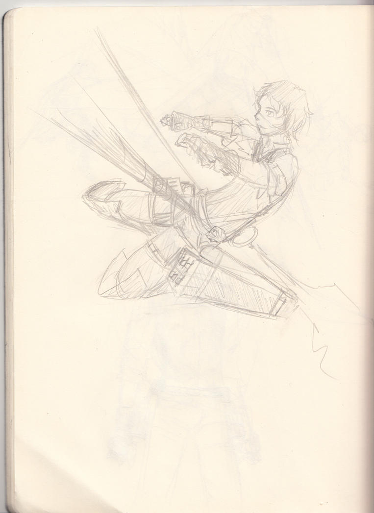
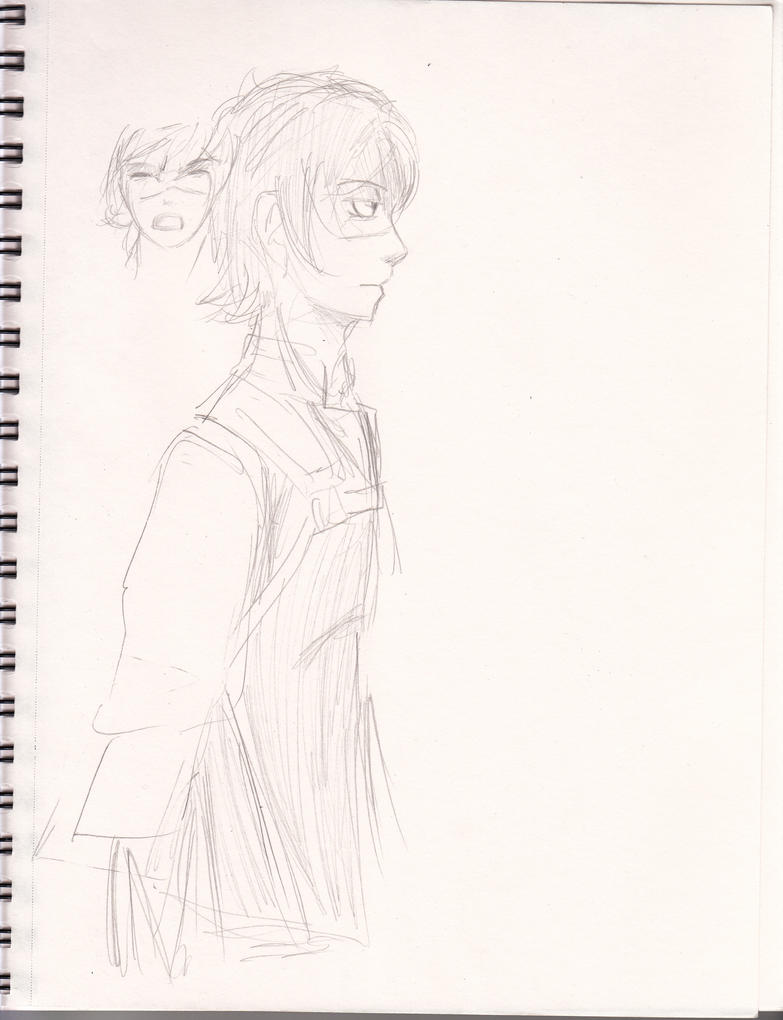
@ Sketcher: Not bad for rough sketches. I'm not particularly up on anime/cartoon styles, so perhaps someone will be able to offer more help than I can on the style you're working in, but just watch your anatomy -- you're not always leaving enough room for features to sit correctly. Take, for instance, this side view:
While it's acceptable to make some sacrifices for anatomy when stylizing artwork, you still have to take into consideration your proportions. Right now, this guy has no room for a brain to be in his head and almost no jaw. By stretching those two areas slightly, the anatomy becomes much more feasible. If you do studies from realism and learn to understand how the body works, it'll help your cartooning immensely. (Because even the most stylized cartoons/anime do have roots in realism.)
Also, be more confident with your line work -- right now your lines are a bit chicken scratchy in places. If you make more solid lines rather than hatching them in, the work will automatically jump to the next level. (Because it makes it look like you're doing everything on purpose, rather than guessing and being hesitant to commit to the lines you're making. If you're going to make a mistake, it's no problem because you can erase it. Don't be afraid to draw those lines with confidence, even if they're wrong! If you believe in your work, others will too.)
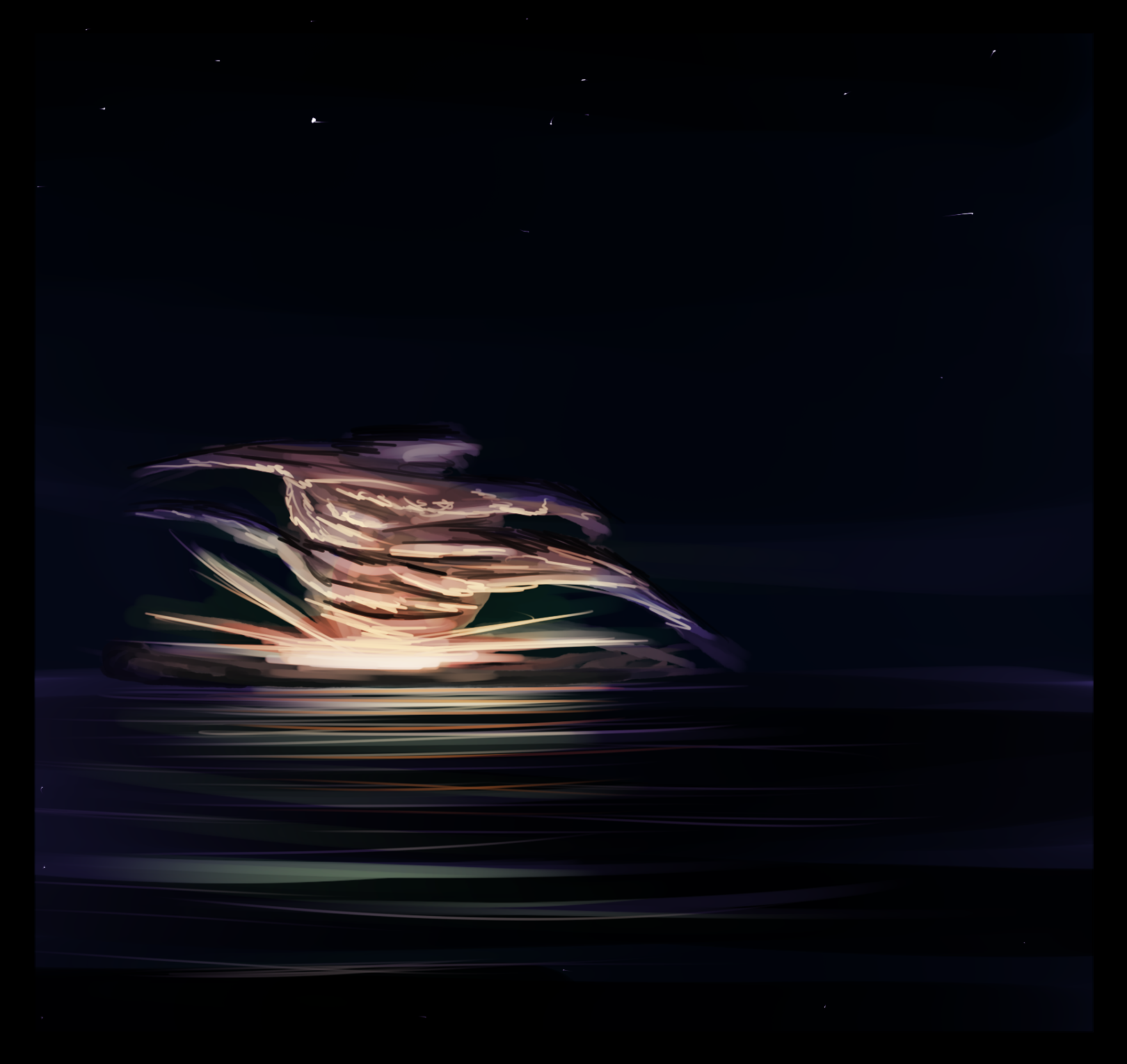
@ Dinh AaronMk: Don't paint with black and white -- it's really making your color work suffer. (Everything looks dull and washed out -- you're missing some really awesome opportunities to have vibrancy with things like the explosion in the first piece or the directional lighting in the second one.)
I think the best thing I can recommend for you is to do master studies. You clearly have a decent handle on how to use your chosen program to paint, now you just need to learn how to apply your colors and render out form. Do you have any favorite artists? I usually recommend starting with the classics (Sargent, Bouguereau, Caravaggio, ect.) because they really are masters in how they used colors/lighting/brushwork, but some of the artist today have studied under them and you can also use their work to learn from as a result. Tell me some artists you admire and we'll see if we can't point you in the right direction in getting your work up to the next level.
@ Roran: Watch your anatomy -- the foreshortening in the first piece is a very tricky angle. The second piece is more direct, but the head and the left wrist are at funky angles, themselves. (That wrist looks really painful bent like that. Try to emulate it with your own wrist and you'll see that angle isn't comfortable at all. lol) The head on the second piece feels a bit small to me, despite it looking downward. (You may want to do some studies from photos, or life, of heads in similar positions so you can see how it works in relation to the rest of the body.
You're definitely improving at layering your armor pieces and the general gestures of your drawings. Keep it up!
______________________________________________________________________
Keep up the great work everyone! I look forward to seeing more updates! ^_^

By not painting in cast shadows (caused by areas of the plant which block light from reaching other spots on the plant), it takes away a lot of the depth and the direction of the lighting, which helps to make the subject more visually interesting. By missing the cast shadow being created towards the center of the plant, for instance, you've taken away the ability to show which parts of the plant are actually receiving more light than other areas -- this negates any sense of depth there.
Always pay attention to the direction of your light and the subsequent shadows that the specific direction creates. Cast shadows can be a HUGE thing to miss when trying to indicate any realism/depth in a piece because cast shadows can really help solidify a light source. (Unless all the lighting is diffused, which is rarely the case.)
@ Sketcher: Not bad for rough sketches. I'm not particularly up on anime/cartoon styles, so perhaps someone will be able to offer more help than I can on the style you're working in, but just watch your anatomy -- you're not always leaving enough room for features to sit correctly. Take, for instance, this side view:

While it's acceptable to make some sacrifices for anatomy when stylizing artwork, you still have to take into consideration your proportions. Right now, this guy has no room for a brain to be in his head and almost no jaw. By stretching those two areas slightly, the anatomy becomes much more feasible. If you do studies from realism and learn to understand how the body works, it'll help your cartooning immensely. (Because even the most stylized cartoons/anime do have roots in realism.)
Also, be more confident with your line work -- right now your lines are a bit chicken scratchy in places. If you make more solid lines rather than hatching them in, the work will automatically jump to the next level. (Because it makes it look like you're doing everything on purpose, rather than guessing and being hesitant to commit to the lines you're making. If you're going to make a mistake, it's no problem because you can erase it. Don't be afraid to draw those lines with confidence, even if they're wrong! If you believe in your work, others will too.)
@ Dinh AaronMk: Don't paint with black and white -- it's really making your color work suffer. (Everything looks dull and washed out -- you're missing some really awesome opportunities to have vibrancy with things like the explosion in the first piece or the directional lighting in the second one.)
I think the best thing I can recommend for you is to do master studies. You clearly have a decent handle on how to use your chosen program to paint, now you just need to learn how to apply your colors and render out form. Do you have any favorite artists? I usually recommend starting with the classics (Sargent, Bouguereau, Caravaggio, ect.) because they really are masters in how they used colors/lighting/brushwork, but some of the artist today have studied under them and you can also use their work to learn from as a result. Tell me some artists you admire and we'll see if we can't point you in the right direction in getting your work up to the next level.
@ Roran: Watch your anatomy -- the foreshortening in the first piece is a very tricky angle. The second piece is more direct, but the head and the left wrist are at funky angles, themselves. (That wrist looks really painful bent like that. Try to emulate it with your own wrist and you'll see that angle isn't comfortable at all. lol) The head on the second piece feels a bit small to me, despite it looking downward. (You may want to do some studies from photos, or life, of heads in similar positions so you can see how it works in relation to the rest of the body.
You're definitely improving at layering your armor pieces and the general gestures of your drawings. Keep it up!
______________________________________________________________________
Keep up the great work everyone! I look forward to seeing more updates! ^_^
Roran Hawkins
Member
Seen
10 yrs ago
Thanks for the critique and advice! I'm having a slight break in drawing as most of my sketches now appear on my university notes again, and collecting them, grading them and uploading them is such a hassle. I'll post some soon so you can all see how horribly little I've improved so far, and I'll takeup on your advice. I was abit shy of posting critiques here, but now you mentionned it, we are all artists to some degree, and it can most likely never hurt to hear multiple opinions about your work. Let's get this silence out of the way and start posting drawings again!
monstahunta
Member
Seen
11 yrs ago
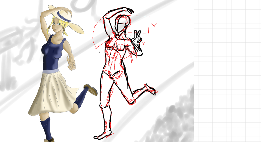
I did the outline in red for this one, and it ended up ruining anything I wanted to do with her eyes. =\
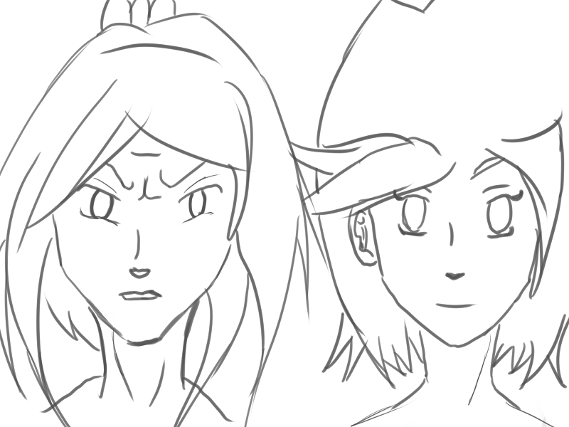
These two are sisters that I came up with for a comic that I'm planning on doing once I improve my abilities enough. They're sisters that have very similar personalities, but very different ideologies. I really like drawing the younger sister, as I'm sure you could tell.
I'm conflicted about this one. I really don't know how to feel about it. I felt very accomplished when it was finished though, as it's probably the best I've ever done for painting skin.
I think most of the problem is I just used a very soft brush to paint everything, and the obvious lack of background.
Roran Hawkins
Member
Seen
10 yrs ago
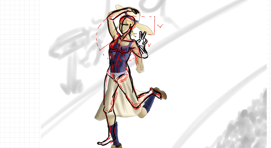
I've done a draw-over on your last drawing to show my points. Beware, it was done with an online painting tool and a computer mouse.
Your pose is a bit awkward due to the weird angle of her left arm and hand (a fault Sherlock pointed me at in my last drawing). When trying to draw someone in a certain pose, always try to find references for it or getting someone (even yourself- to quickly pose for you. You easily have acces to someone doing said pose naturally, and basing yourself off of that adds a genuine feeling to it.
Furthermore I would recommend delving further into the topic of anatomy. As you can see I left my sketches of the drawover (in red) still there so you have an idea of how I specifically use shortcuts to learn anatomy. Anatomy is the one thing that makes or breaks most if not every drawing of an organism that's intended to be at least semi-realistical, and still the bane of even artits like Sherlock. The only cure is lots of practice and references. A short summary of faults I immediately noticed: Her breasts were too low and had a really sphere-like shape, as if someone cut a ball in half and taped them to her ribcage. While in a front on drawing of a relaxed pose this is not too noticable, once movement is involved the breasts move along. (the same with breasts of men. I just watched myself in the mirror today, it's almost spooky how they can move if you pay attention to it.) Secondly, her arms, legs and middle were all too long. I can give you the advice when drawing without clear or with little references to use parts of the body you already drew to measure the parts you still have to draw. A good measuring unit for example is the head.
Handy links:
° http://farm2.static.flickr.com/1021/836560773_9dc73c2e2f.jpg
° http://illustrationage.files.wordpress.com/2013/04/andrew-loomis-figure-drawing-for-all-its-worth.pdf
Also, one of my own:
monstahunta
Member
Seen
11 yrs ago
Roran Hawkins said
I've done a draw-over on your last drawing to show my points. Beware, it was done with an online painting tool and a computer mouse.Your pose is a bit awkward due to the weird angle of her left arm and hand (a fault Sherlock pointed me at in my last drawing). When trying to draw someone in a certain pose, always try to find references for it or getting someone (even yourself- to quickly pose for you. You easily have acces to someone doing said pose naturally, and basing yourself off of that adds a genuine feeling to it. Furthermore I would recommend delving further into the topic of anatomy. As you can see I left my sketches of the drawover (in red) still there so you have an idea of how I specifically use shortcuts to learn anatomy. Anatomy is the one thing that makes or breaks most if not every drawing of an organism that's intended to be at least semi-realistical, and still the bane of even artits like Sherlock. The only cure is lots of practice and references. A short summary of faults I immediately noticed: Her breasts were too low and had a really sphere-like shape, as if someone cut a ball in half and taped them to her ribcage. While in a front on drawing of a relaxed pose this is not too noticable, once movement is involved the breasts move along. (the same with breasts of men. I just watched myself in the mirror today, it's almost spooky how they can move if you pay attention to it.) Secondly, her arms, legs and middle were all too long. I can give you the advice when drawing without clear or with little references to use parts of the body you already drew to measure the parts you still have to draw. A good measuring unit for example is the head. Handy links: ° http://farm2.static.flickr.com/1021/836560773_9dc73c2e2f.jpg° http://illustrationage.files.wordpress.com/2013/04/andrew-loomis-figure-drawing-for-all-its-worth.pdf
Thanks for the tips, and especially the draw-over. =]
I'll make sure to try to learn the, "heads as units of measurement", thing again. I could never seem to get that right when I try to use it in my drawings, but it's been a few months, so hopefully It will click better as I'm practicing.
As far as using a reference, I recently bought an armature to use for posing, but I haven't got the hang of using it yet. =T
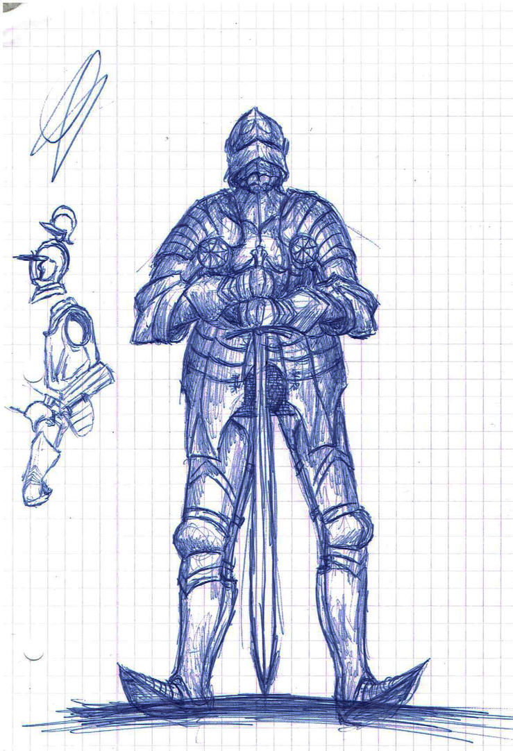
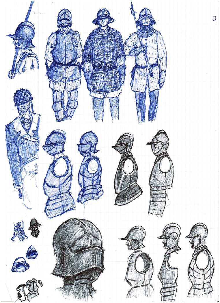
Roran Hawkins said
Also, one of my own:
These look great.
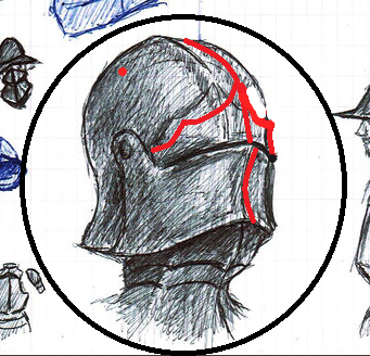
My favorites are the first guy, in the second row, (with the hook for a hand), and the image of just the man's head in his armor.
From the looks of it though, it seems that you overcompensated for how offset the center line would be between the lower portion of the helm, and the top portion.
Robeatics Codename: Fupa
Member
Seen
1 yr ago
I would love to join this, I feel like it'd be good motivation for me to improve myself. C: I can also offer up critique, despite being some inexperienced little high school art student.
Here's a few older pictures from around the beginning of the summer, I've improved mildly in anatomy and posing but I still have a while to go. I'll try to get up fresher drawings once I can get a hold of them! (Forgive the crappy, enormous phone pictures. :,0 )
Here's a few older pictures from around the beginning of the summer, I've improved mildly in anatomy and posing but I still have a while to go. I'll try to get up fresher drawings once I can get a hold of them! (Forgive the crappy, enormous phone pictures. :,0 )


Robeatics Codename: Fupa
Member
Seen
1 yr ago
Ink-berry said
Alright, I was doodling last week, and this was what I ended up with. :p (It's rather PMMM inspired, by the way.) I know the arm / elbow in particular looks a little weird, as well as the placement of the hand, but I don't really know how to fix it. Could I have some help with that, if possible? Also, do you guys have any advice on how to move from a more anime-ish style to a more semi-realistic style? I'm tempted to switch, but don't really know how.
Ooh! I can help! A big thing to do is to just start drawing from life as much as possible. Look at some good reference photos and study them, look at the people around you (without being creepy haha) and see how their bodies move, twist, stretch and relax. I think a big issue with switching over to semi/realism is the faces and other such details. A problem with me, evident in my sketches, is faces. I would love to go for a comic book-y sort of realism but, alas, I am awful with faces that don't look deformed or make my people look like a bunch of ridiculous no-lip fish monsters. Anime doesn't particularly switch up proportioning as far as the figure, so just keep in mind that limbs and the body looks vastly different dependent upon body type, angle and positioning and the transition body-wise might not be too bad.
Also to fix that elbow/slightly short arm! The elbow typically goes down to the navel, which in turn is about in the center of gravity, or the middle of the abdomen. If you have any other issues that you can't quite place as far as anatomy or posing, look in a mirror or look down at yourself. If there's someone else with you, you might be able to ask them to pose. You are one of your most convenient references! So long as you aren't a little person or have other such major variations in proportioning, feel free to use yourself for quick little ideas of what a pose/figure should look like.
monstahunta
Member
Seen
11 yrs ago
Robeatics said
I would love to join this, I feel like it'd be good motivation for me to improve myself. C: Here's a few older pictures from around the beginning of the summer, I've improved mildly in anatomy and posing but I still have a while to go. I'll try to get up fresher drawings once I can get a hold of them! (Forgive the crappy, enormous phone pictures. :,0 )
Sketch 1: I'm not sure if it's just my internet, (which is terrible), or not, but I can't see this one.
Sketch 2: Anatomy-wise, it looks really good to me. I would suggest shading in the cast shadow from the nose to help add a little more depth. Good job, though.
Sketch 5: I love the detail on the arms, but I would suggest thinking about how a silhouette of the figure would look, and if the silhouette would clearly convey what you're trying to present to the viewer.
Sketch 6: Needs some clothing folds. Even if you think an article of clothing wouldn't be affected by the underneath figure so much, it would still bunch up on itself.
EDIT: So I've been practicing my anatomy.
(It's not especially detailed nudity, as just the shape of the breasts are drawn, but this image is of a female character not wearing any clothes. Yet.)
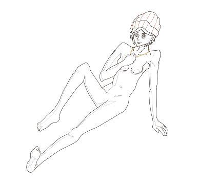
I have a feeling something is off in her shoulders, and I couldn't really figure out how to place her left hand to look right.
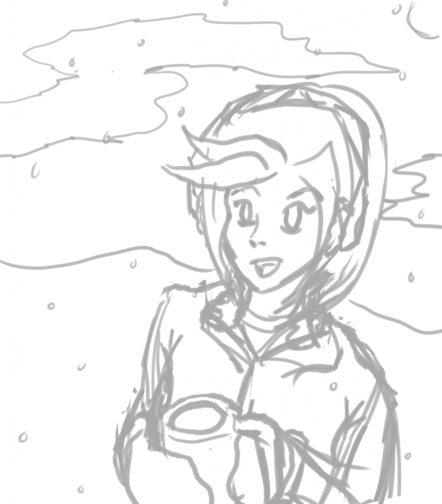
Also since I was inspired to draw a picture of someone having some hot chocolate, I did this really rough drawing to practice my perspective.
Roran Hawkins
Member
Seen
10 yrs ago
Sorry for the long absence, but here I am again!
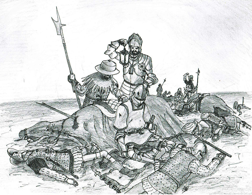
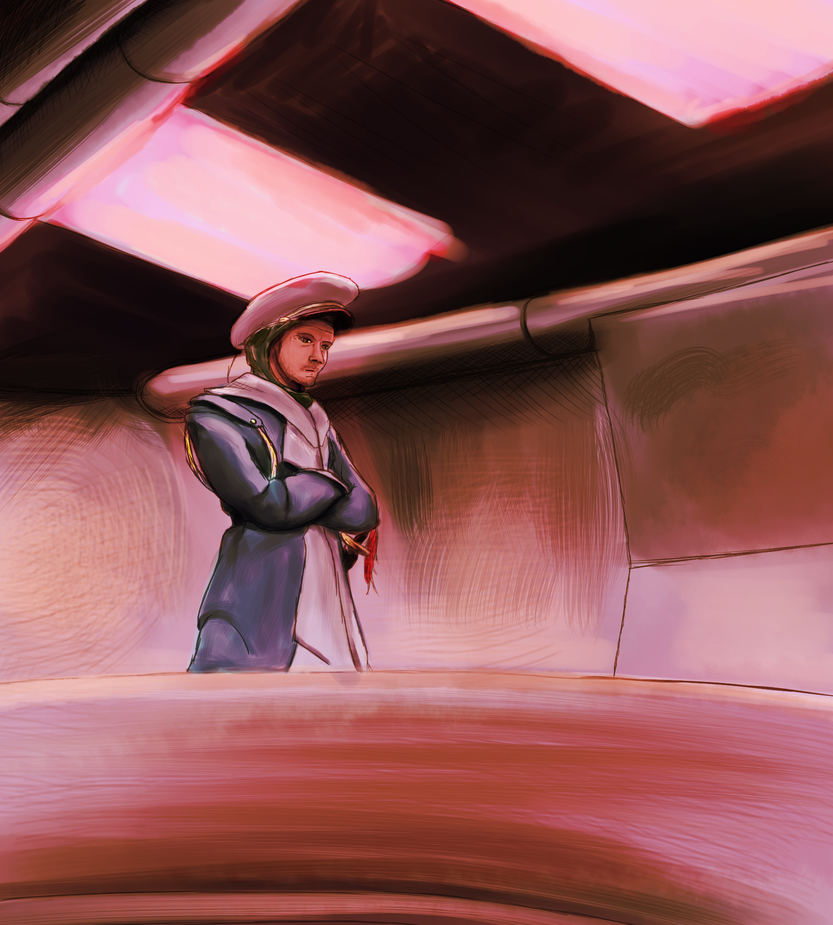
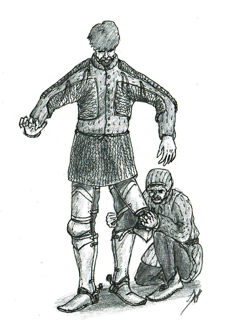
It is the 7th of March in the year of 1473. During the past day two armed forces collided on the soft plains a few kilometers East of a small and unnamed village. Both forces were composed of the levies of the two Dukes facing off and their vassals, bolstered with respectable numbers of professional man-at-arms and mercenaries. The armies met during the early afternoon after the smaller force surrendered its superior defensive position across the river, luring their enemies to attack. The river now covered one flank and their rear, but would also turn a mass rout into a pure slaughter, a risk that could turn a single defeat into the end of the war, something Duke Amand knew all too well. As the larger force of Duke Godwin advanced and skirmishing forces of lighter cavalry, archers and crossbowmen tried the lines of the defenders and attackers alike, untill the attacking force found a weak spot in the right end exposed flank of the defenders. A general advance was ordered as the Duke Godwin personally led a charge of heavy cavalry into the undefended flank, routing the defenders' crack crossbowmen in a blink. Once the charge had watered down into a slaughter, a company of veteran pikemen charged the immobilized heavy cavalry, forcing them to withdraw. Once back behind their own lines however, the Duke of the attacking army had gone missing, and his host fell into dissarray as the general advance failed to break through the enemy lines, the heavy cavalry charge not yielding the expected succes. The attacking army fell into a mass rout as the battered but brave defending army counter-charged the wavering attack.
After the battle was fought the defenders quickly regrouped with the same good discipline they had shown during the fight, and retreated over the river to march back and relieve their besieged homes. The night after the battle the bravest and most loyal of the attacking Duke's army dared venture North again to inspect the battlefield, left unlooted by the disciplined victors, to find their leader propped up against his horse, the signature of a warhammer deeply embedded into his skull.
Duke Godwin is seen wearing a rare combination of a sallet and an armet in the English style with a high and pointed top. The bodies strewn around him are unlucky crossbowmen caught in their thunderous charge and the occasional mercenary pikemen that fell during the counterattack. In the distance more fallen knights are being identified by the men in order to give proper burials and to recover their bodies for their houses, and to note down for which nobles a letter of ransom would be unrequired.
Touch of Insanity
Member
Seen
6 yrs ago
Alright so I did this for the second community challenge, but I feel like some things are off. It was based of of a picture which I'll also link. I did make some changes too it, because I felt the image I was taking it from wasn't correct or I just wasn't able to get the body flow without getting angry. Trust me, my new room mate learned who I art rage.

Linky
Linky
© 2007-2026