Here it is:
Main issues I detected:
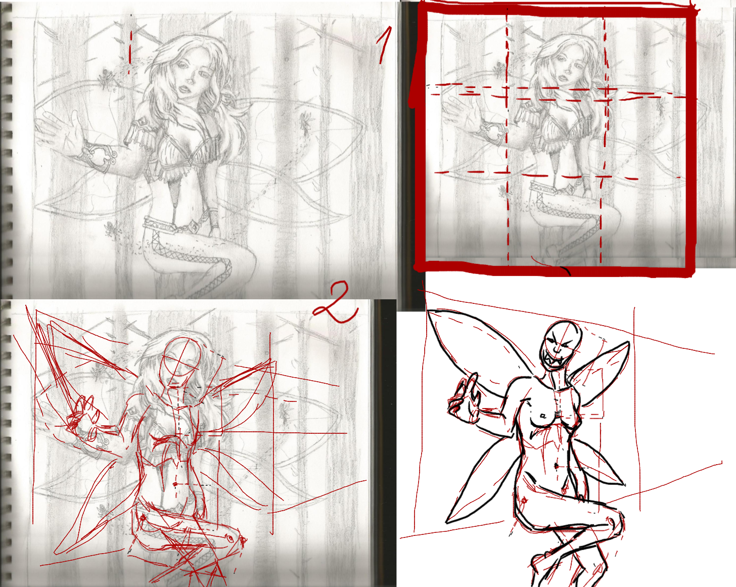
1) When drawing anything, composition is key. Especially when you have a bordered piece and it's supposed to be a real drawing, not a sketch. Therefor you best center youe subject. But how large should the subject be compared to the borders of your drawing? If you mentally divide your paper into three equally large strips (aka, 3x3 or a 9 cube field) it's ideal if your subject's main mass fills the center cube. I tried to show, but apparently the drawing program derped out a bit so it's not an ideal depiction.
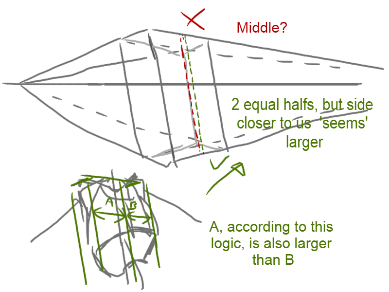
2) I'll continue with anatomy and perspective. First and foremost comes the foreshortened arm. Due to placing your entire character in perspective and having the arm be outstretched towards us at a different angle you gave yourself quite the challenge, and it didn't quite come out that well. Foreshortening is just very hard. Practice is key, and use references. Lots. When drawing the body in perspective though you have to keep in mind that the side closest to the viewer will be larger aswell. I illustrated it here. As you can see in the drawover, you made the same mistake with the fairy wings.
To continue on true anatomy, you'll have to keep working on getting the proportions right, as every artist in existance will have to. The better you get at it, the more realistic and believable drawings you can make, regardless of how detailed or simple your style is. I could sum up the anatomical errors you made, but that'd be nitpicking and annoy the both of us. The drawover wasn't perfect either, because my drawing is kinda borked up aswell as it is now, but I'm too lazy to make further corrections. Her body is a tad too long, and her back is perfectly straight, which makes it weird-looking because she's floating and moving.
3) Pose. She seems to be standing while at the same time floating, and her left arm is just hanging straight down. By adding some small movement in the picture you can give the feeling something is going on and that the character is actually alive and breathing, and not a static robot just standing there. To learn it? Practice! In this case it helps to do pose-drawings of people doing stuff, ranging from standing around to doing flips. Once you get the hang of how people move even when standing still, you can, without reference, create a lot more believable and realistically looking characters.
4) Last but not least, concept. Perfect and normal and realistic anatomy is one thing, but as an artist you don't have to draw perfect humans at all time. The point of learning that is that once you can draw a 'perfect' human somewhat reliably, you can deviate from this and create a wild variaty of different characters in both build and stature. here you drew what I suppose to be a fairy or an elf. Despite that she feels rather sturdy and almost plump. They are known as very light and fragile looking creatures, (dependant on the lore elfs may or may not be sturdier in general qua looks, but still thinner than humans) and they have as a result very thin limbs, frail-looking joints and look like anorexic people in general. Since I don't know exactly what your intention was with this one, I'm going to leave it at this, and just give you the advice to manipulate anatomy (be careful with it though) to make a drawing more believable or fitting into a certain sphere.


